10 Ways Packaging Shapes What We Buy and Eat

Packaging is more than a container; it is a silent salesperson that influences decisions long before food reaches our plate. From colors and fonts to portion sizes and eco-friendly messaging, every detail is designed to guide our choices. We may not realize it, but the way food is wrapped, boxed, or labeled shapes how we perceive its freshness, health value, and appeal. Understanding these subtle cues reveals how packaging plays a powerful role in what we buy and eat.
Color Psychology

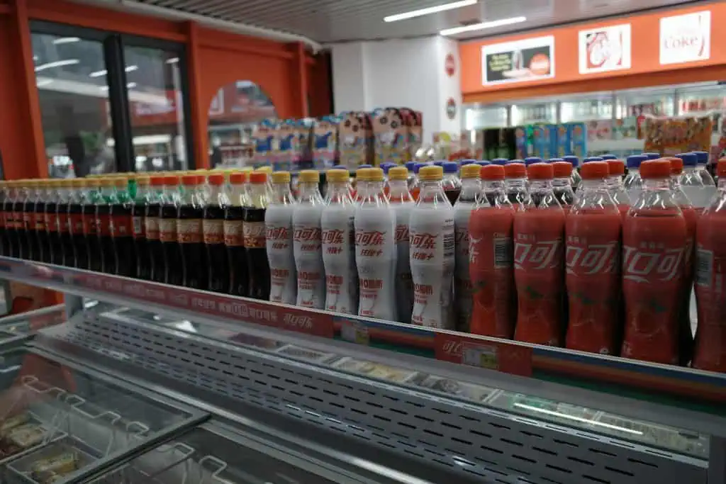
Colors on packaging influence our perception of flavor and health. Bright reds and yellows catch attention and spark cravings, while greens and earthy tones suggest freshness and natural ingredients. A chocolate bar wrapped in deep brown feels indulgent, while a snack in pastel shades feels lighter and healthier. These subconscious signals lead shoppers to associate colors with taste and nutritional value before even opening the package.
Portion Size Illusion

Smaller packages or divided portions create the impression of moderation, even if the total calories are the same as a larger serving. Individually wrapped snacks encourage pacing, while large family-size bags often lead to overeating. The size and structure of packaging guide how much we eat without conscious calculation. By framing portions strategically, brands influence both purchase behavior and consumption habits in subtle yet impactful ways.
Use of Images

Pictures on packaging strongly shape expectations. A cereal box with ripe fruit on the front leads consumers to believe it is healthier, even if the fruit is only decorative. Similarly, images of sizzling burgers or creamy desserts stimulate appetite and make foods feel more appealing. These visuals create a promise of taste and quality that drives buying decisions, even when the actual product differs from the imagery.
Typography and Fonts
Fonts communicate personality and purpose. Bold, playful lettering can make a product feel fun and indulgent, while sleek minimalist fonts suggest sophistication and health. A juice box labeled in handwritten-style text feels artisanal and natural, while blocky type may signal mass production. The choice of font is rarely accidental; it nudges shoppers toward certain perceptions and emotions, shaping what they expect from the food inside.
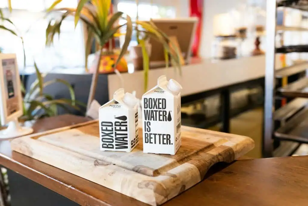
Eco-Friendly Messaging

Words like recyclable, biodegradable, or eco-conscious signal responsibility and care, making products more appealing to environmentally minded shoppers. The use of earthy textures or natural-looking paper reinforces this image. Even if the food is unchanged, sustainable packaging builds trust and a sense of alignment with values. Many consumers will choose one brand over another simply because the packaging highlights its environmental friendliness.
Transparency in Packaging

Clear windows and transparent containers make foods appear fresher and more honest. Being able to see the product inside creates confidence in its quality and reduces hesitation to buy. A salad in a clear container looks crisp and inviting, while opaque packaging leaves buyers relying only on labels. Transparency not only improves appeal but also strengthens trust between brands and consumers, reinforcing purchase decisions.
Health Cues and Labels

Phrases like low fat, organic, or high protein influence how foods are perceived, regardless of the actual nutritional content. Highlighted labels and health badges act as shortcuts for busy shoppers scanning shelves quickly. Even when differences are minimal, these cues sway choices. By using language that frames products as healthier, packaging shapes not only what we buy but also how we feel about eating them afterward.
Limited Editions and Seasonal Designs

Special edition packaging builds urgency and excitement. Festive colors or seasonal imagery make products feel exclusive, prompting shoppers to buy before they disappear. Pumpkin designs in fall or red and gold in the holidays trigger emotional connections that link food to celebrations. Even when the product is unchanged, seasonal packaging transforms it into something special, boosting sales and reinforcing traditions around eating.
Convenience Features

Easy-to-open seals, resealable bags, or single-serve packs enhance practicality and encourage repeat purchases. Convenience packaging fits into busy lifestyles, making it easier to snack on the go or save leftovers. These features subtly increase how much and how often we consume products, since food is always accessible. By simplifying use, packaging not only sells food but also guides everyday eating habits in ways we rarely notice.
Branding Consistency
Recognizable logos, colors, and layouts make brands feel familiar and trustworthy. Shoppers often reach for the same packaging without second-guessing, guided by habit and recognition. Consistency reinforces loyalty and makes new products under the same brand easier to accept. Even small design elements signal continuity, ensuring customers keep buying and eating in predictable patterns shaped almost entirely by packaging cues rather than product differences.


